I think that Yu-Gi-Oh has some of the Coolest Art of any TCG on the market right now.
Magic: The Gathering has amazing realistic art, and Pokémon has adorable cutesy art, but Yu-Gi-Oh gets it just right with a mix of cartoony fun, epic fantasy, and awesome sci-fi.
It’s the only game like it.
This list will go over some of the best card art in the whole Yu-Gi-Oh TCG.
Note that this list is completely subjective, and I’m sure I’ve missed some cool pieces of art.
This is more about the most famous pieces of art in the past of Yu-Gi-Oh and some of the less well-known cards as well.
Let’s look at some shots!
21. Red-Eyes Flare Metal Dragon
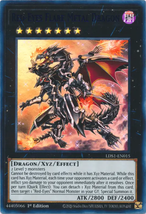
The Red-Eyes Flare Metal Dragon is an amazing version of the Red-Eyes Dragon. Its pose shows how big and bulky Red-Eyes is.
The orange and red colors in the background go well with the picture because dragons are usually known for their fire.
Detailing gives the Dragon a rough, metal look, and drawing the wings so they look like they are ready to fly gives the picture a sense of impending doom.
The Dragon’s body is narrow, which draws attention to the fact that it is more metal than flesh. This helps to set it apart from the other dragons in the game.
20. Reload
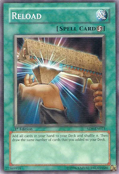
With decks based on Star Wars (Kozmo), circus animals (Performapals), and Dante’s Inferno (Burning Abyss), it’s easy to forget that Yu-Gi-Oh was originally based on ancient Egypt.
Reload is one of those cards with really smart artwork that reminds you of that theme.
It looks like Ancient Egyptian Monoliths, but it shows a gun being reloaded.
I really like how this card’s art has so much charm. And it really takes me back to when Yu-Gi-Oh! was popular in elementary school.
19. Earthbound Immortal Aslla Piscu
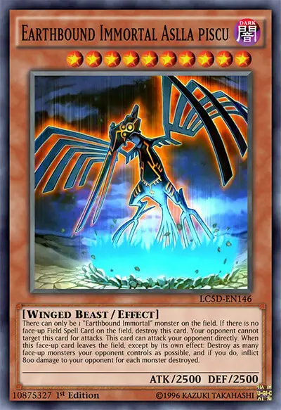
This one is a better example of the whole pattern.
The idea of the Earthbound Immortals is one of the coolest I’ve ever seen for an archetype.
All of them are based on the Nazca lines in Peru. For example, Aslla Piscu is a hummingbird, Earthbound Immortal Uru is a spider, and so on.
It’s really cool that my favorite card game has cards from all over the world, especially ones that look like semi-evil Gods and come from different cultures.
Really, these monsters look like they could kill you.
This is why these card arts are so great.
18. Odd-Eyes Rebellion Dragon
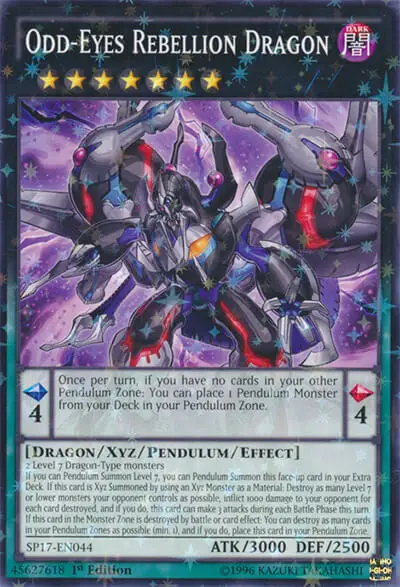
Odd-Eyes Rebellion Dragon is a great example of what would happen if Odd-Eyes Pendulum Dragon and Dark Rebellion XYZ Dragon got together.
It has parts from both monsters that make it clear that this card is a mix of two monsters, and it looks great.
In the anime, this card was called when Yuya and Yuto joined forces and took out their anger on the people who were killing their world.
Odd-Eyes Rebellion Dragon looks like a powerful, angry dragon, which is a great way to show what the card is all about.
17. Polymerization (Original Art)
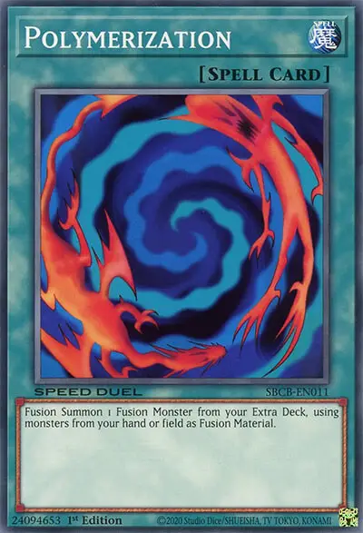
Polymerization is just a card that everyone knows.
People who don’t play Yu-Gi-Oh much might remember this card from when they were kids.
The simple art on the cards is beautiful.
It shows two creatures that look like monsters but aren’t from the cartoon being mixed into one.
I also think it’s cool that you can see your own cards in the show. It gives your cards a magical feeling, which is why Polymerization is one of my favorite cards.
16. Ancient Pixie Dragon
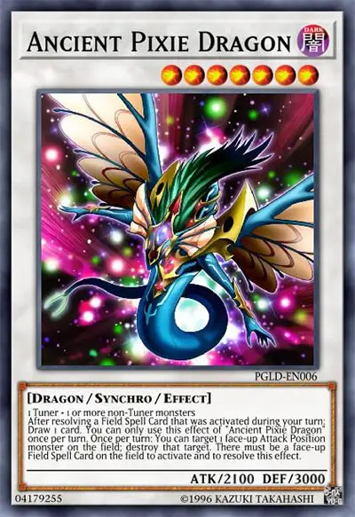
I love everything about this new version of the signer dragons.
In the manga, this card was Luna’s signer dragon. Its function and art were a little different from the cards shown in the anime.
This card’s art looks a lot like the original Ancient Fairy Dragon, but the colors are much darker.
I think this monster looks much scarier and stronger with this darker color scheme, especially in its original gold secret rare printing.
The original art is also very beautiful, but I love how this card art has a darker feel to it.
15. Necroface
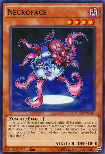
Necroface is my favorite Yu-Gi-Oh card because it is so different from most other cards.
Yu-Gi-I don’t see a lot of artwork on Oh cards that is “creepy to the point of giving you nightmares.”
Really, this card scared me to death when I was a kid…
It’s a doll head with limbs coming out of it.
In Yu-Gi-Oh, though, it’s really cool to see art that’s different from what most people do, and Necroface is a great example of this.
It gave off the feeling that the card was going for, which was a scary movie. And I think it is the best zombie art.
14. Mystical Space Typhoon
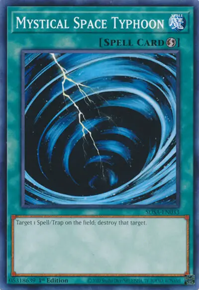
MST is another card that is just beautiful because it is so simple.
It looks like a storm, but it’s not. That’s the end of it.
The way the brush lines swirl around the storm and the lightning just cracks down the middle makes me think of early Magic: The Gathering.
The art on this card is also a lot of fun to extend, and I have a couple of hand-made versions of extended art for a couple of decks!
13. Malefic World
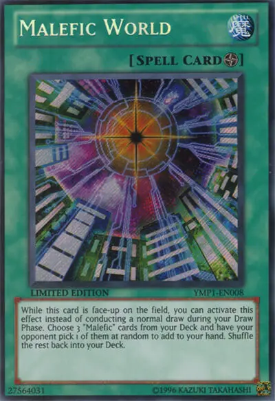
I really hope that Konami decides to reprint all of the Malefic cards at some point, because they are too pretty to stay in the hands of fans who bought them years ago.
As a way to promote the Yu-Gi-Oh: Bonds Beyond Time movie, cards called “Malefics” were put out.
They are a type of monster that has been “stolen” many times in the past of Yu-Gi-Oh.
Malefic world is pretty much a scene from the movie, where the main character shows what a Malefic world would look like.
Our heroes, Yugi, Jaden, and Yusei, defeat the main enemy in this Malefic world, which is what makes this card so great.
It really makes you feel like a Yu-Gi-Oh character in real life.
12. Elemental HERO Sparkman
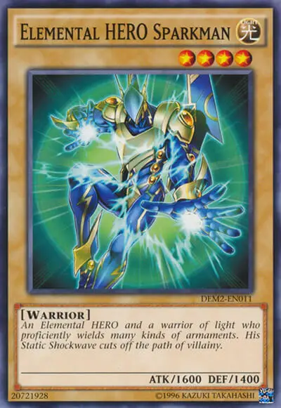
The Elemental HEROs were one of the best parts of Yu-Gi-Oh GX for me, and they had to do with Jaden Yuki.
They were a group of superheroes who used the powers of the elements. When they combined their powers, they made a lot of powerful fusion monsters.
Elemental HERO Sparkman would have to be the best piece of art among them.
He looks like a power ranger, with a focus on power.
This card’s art really fits with the superhero theme of this deck, especially with the cool blue and yellow theme of his gear.
11. Noble Arms – Gallatin
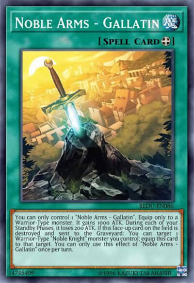
The Noble Knights are the best choice if you want a whole set of cards that are all as beautiful as the last.
The old English stories about the Knights of the Round Table gave rise to this set of cards.
As a person who lives in England, it was really cool to see stories I’d heard as a kid in one of my favorite games.
Noble Arms: Gallatin tells the story of how King Arthur became king by pulling a sword out of stone that was stuck there forever.
The Knights of the Round Table is based on a classic fairy tale, and this type of art really fits with that. The same is true for the rest of the Noble Knights cards.
These works of art look especially great in the platinum rare rarity that is only available in the Noble Knight decks.
This rarity gives all of the cards a beautiful dark tone and brings out the sparkling colors of their swords like you wouldn’t believe!
10. Exodia Necross
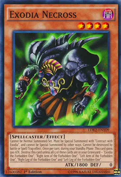
Since I play Yu-Gi-Oh, it’s almost a given that I think Exodia looks cool.
I mean, he’s a locked-up God who’s too strong to fit on a single card.
All of these things are on the Exodia Necross card.
The broken chains on his wrists make it seem like a great and terrible power has been let loose, and his bright red eyes and murky green aura make it seem like Exodia is some kind of undead creature.
Overall, I just love how this card changed where Exodia went.
I almost want to say that it looks better than the original.
9. Soul Pendulum
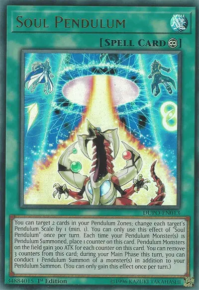
Yu-Gi-Oh Arc V was one of my all-time favorite animes. With the exception of the finish, it was fantastic!
Soul Pendulum shows one of the best parts of the whole series:
When Yuya’s two signature pendulum monsters, Timegazer Magician and Stargazer Magician, are used to call the Odd-Eyes Pendulum Dragon, they are called “signature pendulum monsters.”
The art on this card almost looks like it was taken straight from the show, and it looks great.
It shows the two pendulum scales high up in their pendulum zones, with that magical-looking doorway to bring out the pendulum monsters.
It makes you feel like your own pendulum calls are almost magical, which is how you know a card’s artwork is really good.
8. Dragon Ravine
When field spells were first made, they were used to change where you were fighting.
In the anime, this turned the duel field into an ocean, a mountain, or maybe even the shadow world.
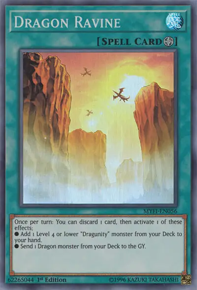
Dragon Ravine looks like a place where you’d really want to fight.
You can see these dragons flying high above and circling while the sunset turns the middle of the valley a burning orange color. It looks like a scene from a magical novel.
This card is a beautiful piece of landscape art, and I wish Kaiba Corp would come up with real-life battle disks so I could fight there.
7. Graff, Malebranche of the Burning Abyss
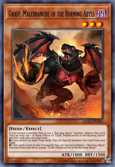
The archetype of the Burning Abyss is based on Dante’s Inferno, an epic poem (and I don’t mean “cool”) about Dante’s trip through hell.
Graff is an awesome-looking demon, which is what you’d expect from a card based on this archetype.
Graff and the other Burning Abyss monsters look so real and scary in their artworks that these cards feel more like Magic: The Gathering artworks than Yu-Gi-Oh artworks.
I love how all of these cards have a dark red and black color scheme, because it makes them look like they came straight from Hell.
6. Red-Eyes Black Dragon (Original Art, LOB)
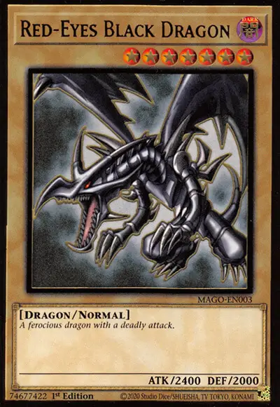
Red Eyes hasn’t been reprinted with different art as much as other famous cards like Dark Magician and Blue Eyes White Dragon.
There have been a few remasters of this piece of art, but I think that if it’s not broken, you shouldn’t fix it.
Red Eyes Black Dragon looks scary in the original art, which is by far the best version.
The setting is also nice and simple, which puts all the focus on the awesome dragon in front of you.
This is the art that Joey Wheeler also used in the cartoon. So, I think a lot of us like this card just because it reminds us of our childhood.
5. Stardust Dragon (Original Art)
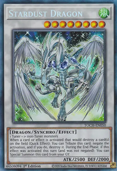
This might be a controversial view, but this is the only main character card whose art I really like.
The other important characters got cards that just looked okay (sorry, Dark Magician), but Stardust Dragon really does look like a legendary beast.
The green and blue stars twinkling behind it make it look magical, like a mix of a dragon from an epic fairy story and a creature from outer space.
This looks even better in the secret rare printing done for the 2008 card tins. The shiny secret rare effect really brings out the star effect.
4. Prophecy Destroyer
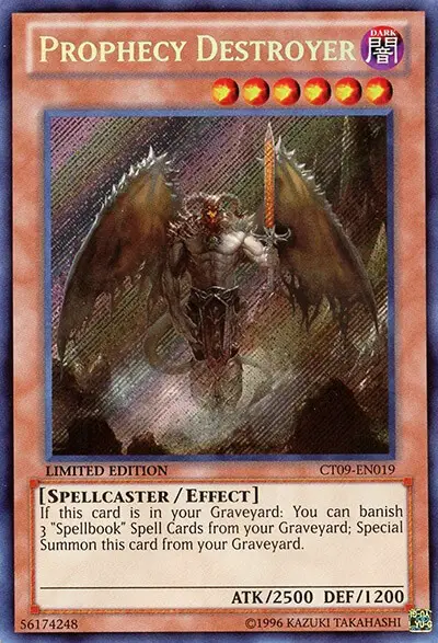
Now this is a card that looks like it belongs to a totally different game.
Compared to the rest of the Spellbook cards, this one has a completely different style, and it looks beautiful.
The level of detail in this card’s art is crazy. Most Yu-Gi-Oh art has thick lines and easier designs, but this card is full of tiny details.
The person who drew this really went above and beyond the Yu-Gi-Oh standard.
His wings have spikes, there are clouds of mist and dust around his feet, and his wicked horns are twisted.
3. Blue-Eyes White Dragon (Original Art, LOB)
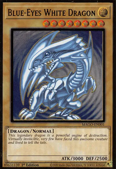
Blue-Eyes White Dragon is a card that is more well-known than the game Yu-Gi-Oh.
It is one of the most well-known cards in the history of playing cards.
So it makes sense that the original art is one of the best!
The combination of the simple blue swirls in the background and the softer-looking Blue Eyes White Dragon in the foreground is both simple and beautiful.
Seto Kaiba used this art in the anime when he said that this card is the “rarest and most powerful card in the world.” This art really shows how strong and rare this card is.
There have been so many different versions of this card’s art that I don’t want to show them all.
Still, this one-of-a-kind piece of art is by far the best of all.
I always look for this piece of art when I’m making a Blue Eyes deck.
2. Yu-Jo Friendship
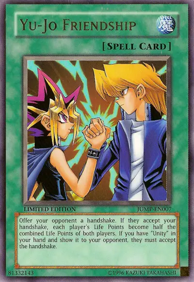
Anime or manga are rarely mentioned in trading card games. But now we’re here.
This was a special card for Shonen-Jump. It came out with two other cards: Unity and Judgement of the Pharoah.
After a battle, Yami Yugi and Joey Wheeler shake hands on the Yu-Jo Friendship card.
Yugi and Joey had one of the best friendships in all of anime, not just Yu-Gi-Oh, so this piece of art really feels warm and loving.
It makes me think about the power of friendship and what we can all do when we help each other reach our goals.
More importantly, it makes me realize that I need to watch the first Yu-Gi-Oh! series again.
1. Slifer the Sky Dragon (TN19 Art)
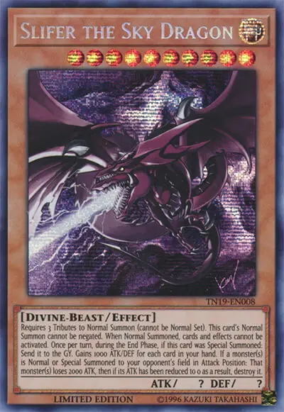
This picture of Slifer the Sky Dragon was made by Kazuki Takahashi, who is the only person who could have done it.
If that name doesn’t sound familiar, you might want to look at the bottom of your Yu-Gi-Oh cards.
Kazuki Takahashi was the original manga artist and author of the Yu-Gi-Oh series. He is the person we have to thank for Yu-Gi-Oh itself.
Takahashi has drawn pictures for a small number of the original Yu-Gi-Oh cards, including all of the Egyptian God cards.
The art on these three cards is the best in the whole game. If I could, I’d give them all first place.
All of these pictures make the God cards look and feel like, well, gods.
In these drawings, they look so strong and old that they don’t look like a force to be afraid of.
In this piece of art for Slifer, the dark and shadowy colors make it look like you’ve woken up an old and magical force.
I don’t know what else will make you feel like a Yu-Gi-Oh main character if that doesn’t.